Page 23 - The Nationals - 2017 Gold WInners
P. 23
BEST LOGO DESIGN


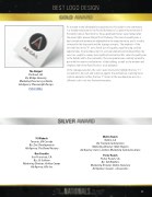
As a leader in the affordable housing industry, this builder’s new community

is a notable milestone for the Pacific Northwest. Located in the north end of

Portland’s famous Pearl District, these apartment homes were named after

the equal rights pioneer Abigail Scott Duniway. This idea of equality was a
key foundational element we highlighted in the brand narrative, and is visually

conveyed in the logo mark and the signage concepts. The emphasis of the

two red lines in the “A” are a literal icon of equality, equal housing, and fair

opportunities. By encompassing it in a circular element and distinguishing it by
color, we sought to convey how significant and central this value of equality was

to the builder and to the community. The color palette was carefully curated to

pair with the interiors and exteriors of the building, as well as the modern and

simplistic feel of the Pearl District’s local ambiance.

In the signage execution, the colors were inversed to highlight the two “I’s”
The Abigail
Portland, OR
correlation to the icon and stand out against the architecture. Carrying these

By: Bridge Housing stylistic elements further, the two “I” letters in the wordmark are also in a
different color to tie into the brand narrative.
Marketing Director: Lyn Hikida
Ad Agency: Placewright Design


PLAY VIDEO


Wallis Ranch
35 Wabash
Toronto, ON Canada
Dublin, CA
By: Trumark Communities
By: Zinc Developments
Marketing Director: Mark Higgins
Ad Agency: The Brand Factory
Ad Agency: Gunn | Jerkens Marketing Communications

One Franklin
Porter Ranch
San Francisco, CA
Porter Ranch, CA
By: JS Sullivan
By: Toll Brothers
Marketing Director: Ashley Camps Marketing Director: Dottie Sweeney
Ad Agency: Allis Inc
Ad Agency: Gauger + Associates


23


